Skip to content
July 3, 2020

Everything you wanted to know about Microsoft SharePoint Online Vertical Sections

Updated June 2023

Vertical sections create a column on the right side of your Microsoft SharePoint pages that contains web parts. 

The ability to have vertical sections in Microsoft SharePoint Online is a fantastic feature for organizations! In this article, we are going to show what vertical sections are, how they can be configured, and some tips and tricks.

To learn more about how to use Microsoft Share Point Online vertical sections on home and news pages, we recommend  reading this article. 

For information on Microsoft Teams and SharePoint, check out our on-demand webinar. 


Microsoft SharePoint Online Vertical Sections Overview

A vertical section is exactly that – a column that can be added to a page in Microsoft SharePoint Online that appears on the right, with the ability to add web parts to it. Previously, it was only an option to add horizontal sections to pages. You now have the option of having a column of content on the right side of the page.

SharePoint-Online-Sections-1-2-1-2
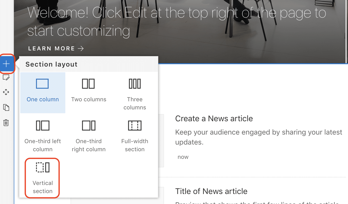
Image: Microsoft SharePoint - Add a vertical column.

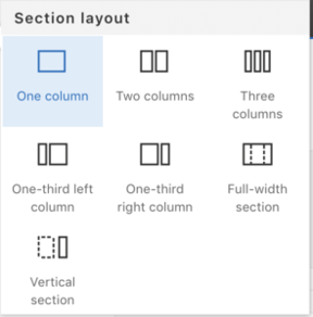
To add a vertical section to a page, click to add a new section and then choose the Vertical Section option. Unlike standard sections, it doesn’t matter where you do this on the page since it is going to be a vertical column running down the entire length of the page.

adding vertical sections SharePoint Online
Image: Microsoft SharePoint - Section layout.

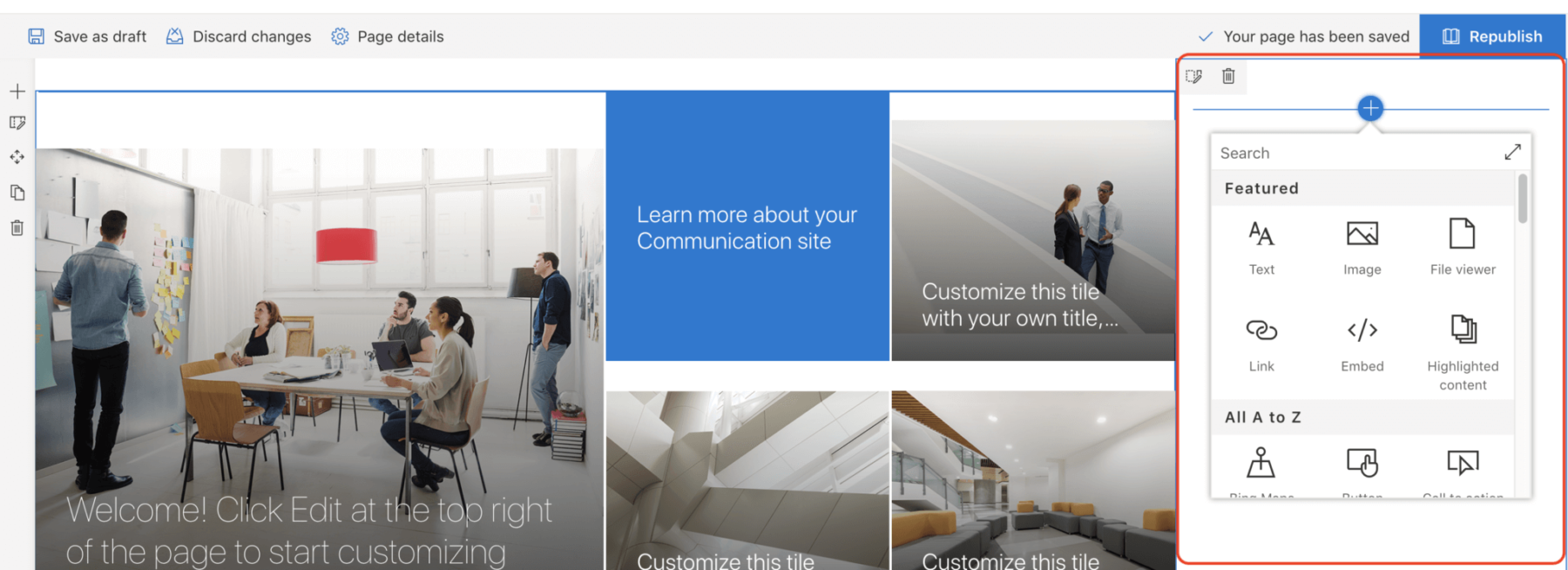
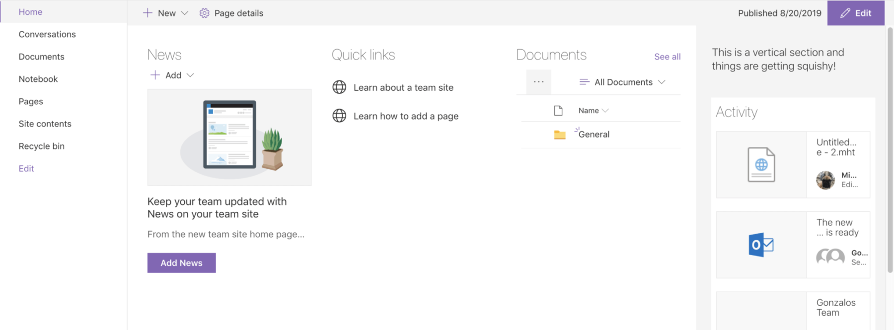
Once you have done this you will see your vertical section appear on the right side of your page. At the moment you don’t have a choice where this appears – it is always on the right-hand side as shown below.

editing vertical sections in MS SharePoint
Image: SharePoint Online - Vertical Sections

Microsoft SharePoint Online Vertical Sections Configuration

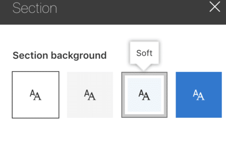
Apart from adding a vertical section, the other thing that you can do is apply a section background to it. This can be really useful to segregate content or to visually indicate that the vertical section contains special or unique content.

MS SharePoint Online section background
Image: Microsoft SharePoint - Edit the background of Vertical sections.

Vertical sections can contain any web parts you want, including the Call-to-Action web part. Want to learn more about these web parts?

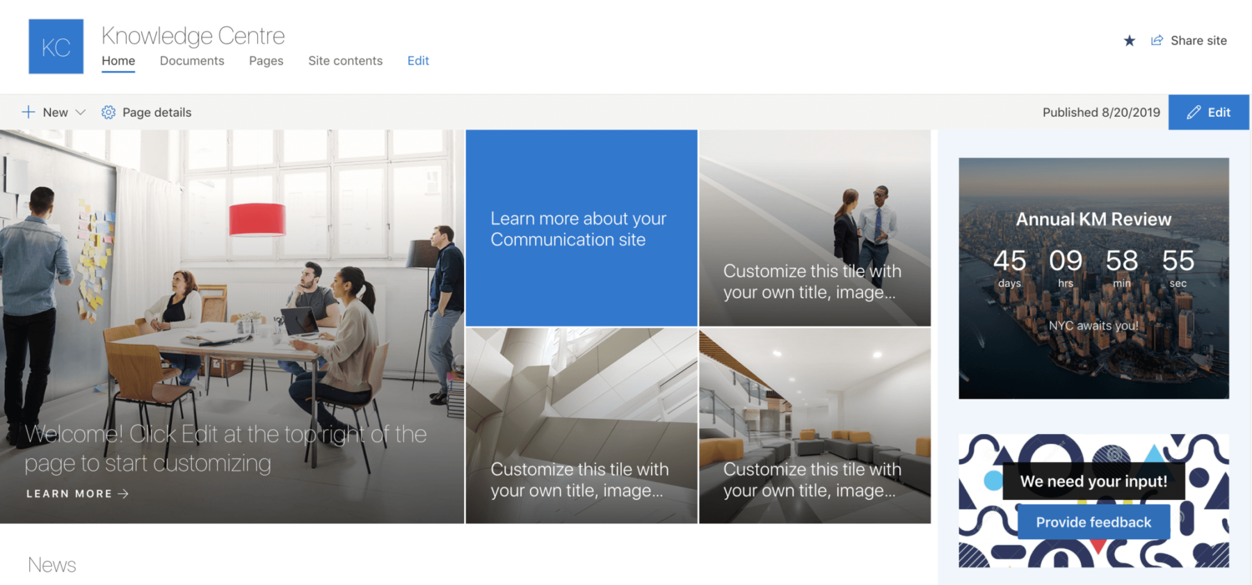
A great example of a Call-to-Action web part is actionable content on the right side of a communication site as shown below:

mcirosoft sharepoint vertical section example
Image: SharePoint Online - Example of Vertical Sections
 

Microsoft SharePoint Online Vertical Section Dos and Don’ts

When using SharePoint Online vertical sections, we recommend that you:

  • Use vertical sections to group logically related content together or to add extra prominence to content. For example, using a vertical section for actionable content or personal content.
  • Use vertical sections to add additional information to pages. Many intranet products have the concept of a right-hand rail that contains additional information about a page such as related content, related links, metadata, and so forth. A vertical section can be used to display this type of information.
  • Consider using SharePoint Online anchor links. 

On the other hand, it’s best to avoid the following:

  • Don’t mix vertical sections that have a background with horizontal sections of the same background color. Instead, give the vertical section a different background color than the horizontal sections.

It seems that a 4 column layout is highly popular with the SharePoint Online user community.

This can be achieved by having a 3 column section along with a vertical section on a page. However, it doesn’t look good on team sites (since you also have to consider the quick launch), and even on communication sites a lot of the web parts don’t seem to scale nicely for 4 columns.

sharepoint online verticle sections for column
Image: Microsoft SharePoint - Vertical sections four cloumn layout.

Things to know about Microsoft SharePoint Online Vertical Sections

  • In responsive view, the vertical section gets pushed all the way to the bottom under the last horizontal section you have. Keep this in mind when thinking about the priority of content.
  • The vertical section column is called Column One and so is the first column in any section. This could cause confusion when trying to explain during content authoring.
  • The vertical section is only available on the right-hand side.
  • You cannot have a full-width column and a vertical section on the same page.
  • You cannot have a full-width column and a vertical section on the same page.

Unleash the Full Power of Micrsoft365 with Orchestry

Most organizations are not using Microsoft 365 to its full potential.

Orchestry makes Microsoft 365 simple for all users.

Orchestry  is an adoption and governance platform that allows End Users, Workspace Owners, IT admins and organizations to take full advantage of Microsoft 365.

To see Orchestry in action, request a demo!


Want more insights like this one?

For more Microsoft 365, SharePoint Online, and Teams insights, tips and tricks, best practices, and exclusive events delivered straight to your inbox, join our mailing list today and level up your Microsoft 365 game!


Other posts you might be interested in

View All Posts